EY.

Loading...
0%
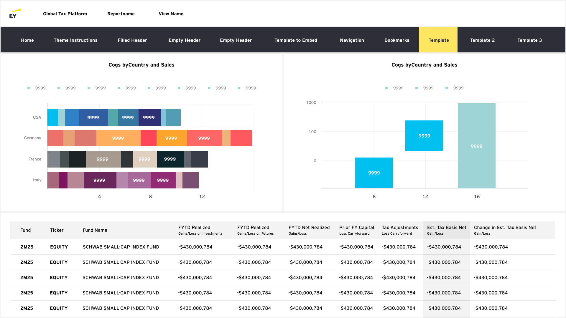

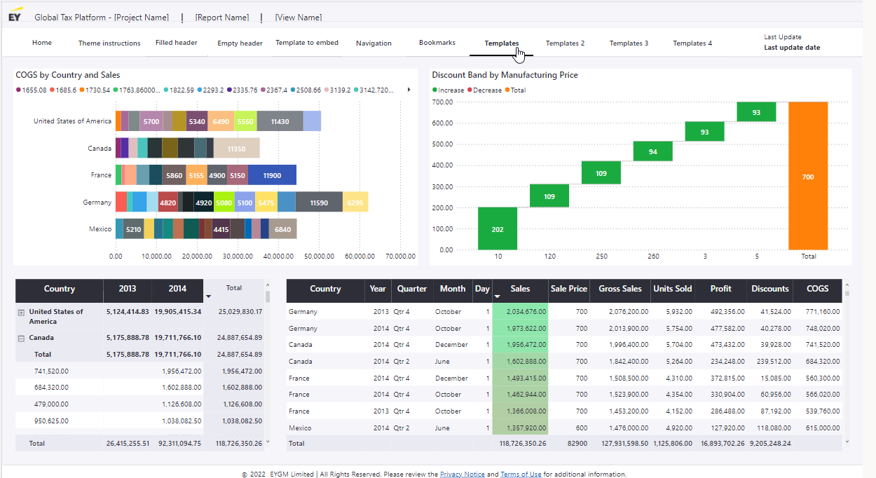
Developers are currently frustrated with their current data visualization format on the EY tax platform. Because the platform holds so many charts and graphs, there is no system currently in place to guide them as to what charts and graphs to use .In addition, because the graphs tend to have so many information displayed at once, there’s no visual hierarchy in terms of color presentation and scaling format.
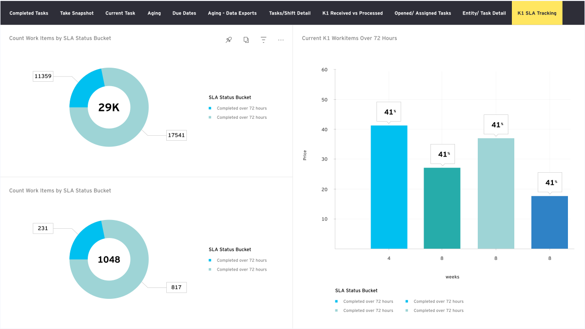
Current report produced by the platform

Name: Alex Johnson
Age: 37
Role: Tax Analyst at a multinational corporation
Goals: Ensure tax compliance, optimize tax strategies, and provide accurate tax reporting using data insights
Daily Tasks:
Data Gathering & Validation.
Tax Calculations & Compliance Checks.
Data Analysis & Strategic Planning.
Reporting & Documentation.
Pain Points:
Data inconsistencies.
Initial research focused on better understanding users’ needs related to their utilization of data in their daily functions.
How do users interact with existing products?
What are users' current pain points with existing products?
Which features are essential to creating an innovative new data visualization system?
A survey was conducted on 25 participants to identify their current satisfaction rate with the platform.
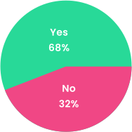
Are you satisfied with the overall experience in the current platform?
Do you think the current platform needs improvement in terms of how the data is organized and presented?
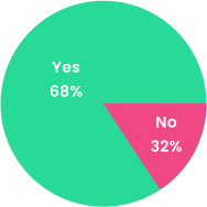
According to the survey, the majority of the users are overall satisfied with the current platform. However when asked if the data could be better organized and presented, an overwhelming majority of the users voted yes. This lead to the conclusion that the majority of user satisfaction lies in presenting the data in a more organized and a better presented format.
A series of in-depth interviews were then conducted on 3 participating analysts to further identify pain points, frustrations, needs, and desires with existing products to determine how the current platform could improve this experience.

The tax platform’s data is confusing. Reports lack clarity, and I struggle to interpret tax calculations. I need better visualizations and explanations to ensure compliance and avoid errors.
-John, Analyst
The platform’s tax data isn’t intuitive. I spend too much time deciphering reports, and I’m unsure if calculations are accurate. Clearer insights and automated explanations would be really helpful.
-Rick, Analyst
I constantly face issues interpreting tax data on this platform. The figures are there, but I don’t know what they mean in context. More user-friendly visuals and guidance would improve efficiency.
-Jamie, Analyst
Lack of Clarity in Tax Data: Users struggle to interpret reports and calculations, leading to inefficiencies and potential compliance risks.
Need for Better Visualizations: Clearer, more intuitive data presentations (e.g., charts, summaries) would help users quickly understand tax implications.
Desire for Automated Explanations: Users want built-in guidance or tooltips to contextualize figures, reducing manual effort in deciphering reports.
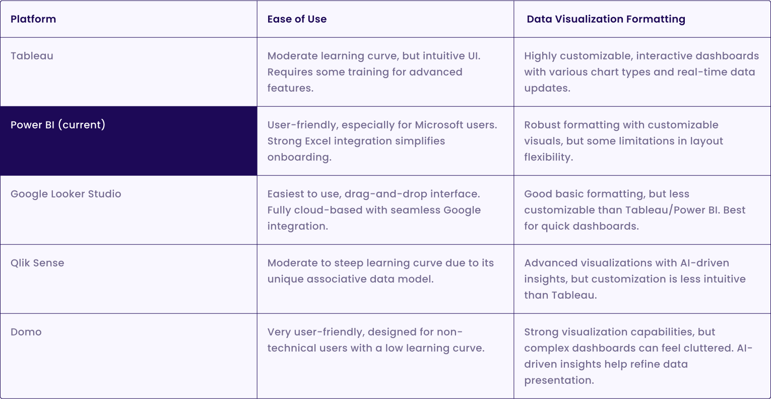
Competitive analysis was conducted to identify competitors' strengths and weaknesses to inform features and information structure.
Create a robust design system that the developers can utilize in order to make more organized and comprehensive tax reports.
The design system can be utilized in a portal where developers can easily create comprehensive tax reports.
The system should be intuitive for users and simple to implement.
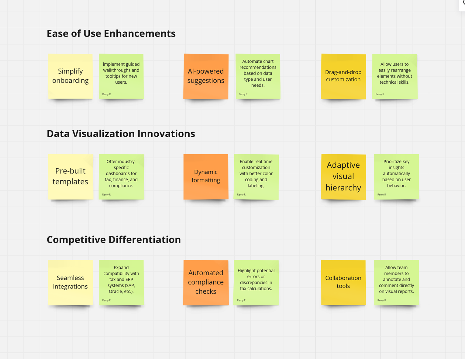
After conducting user interviews, all the participants responses were synthesized to identity themes, opportunities, and features that the current system could focus and improve upon.
Cons
Visually unappealing and Uninspiring.
The color choices are random and disorganized. Lacks structure and cohesion.
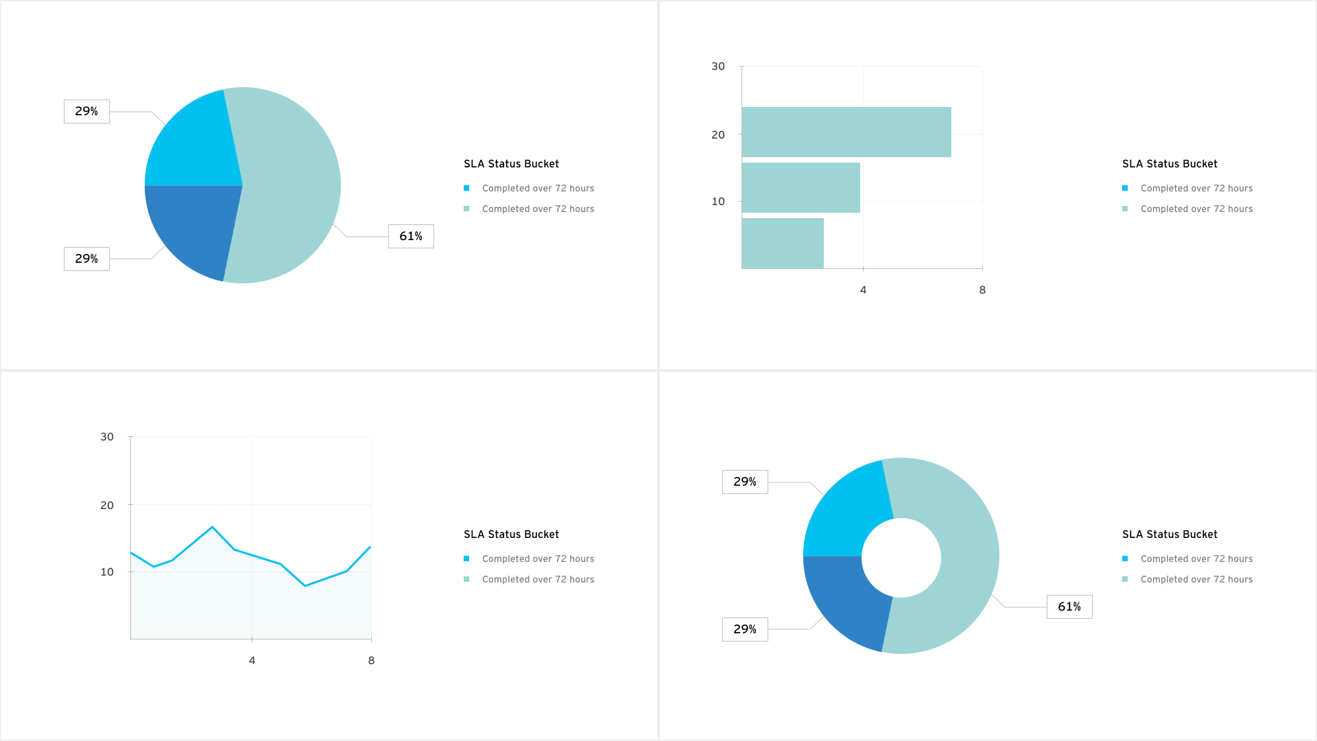
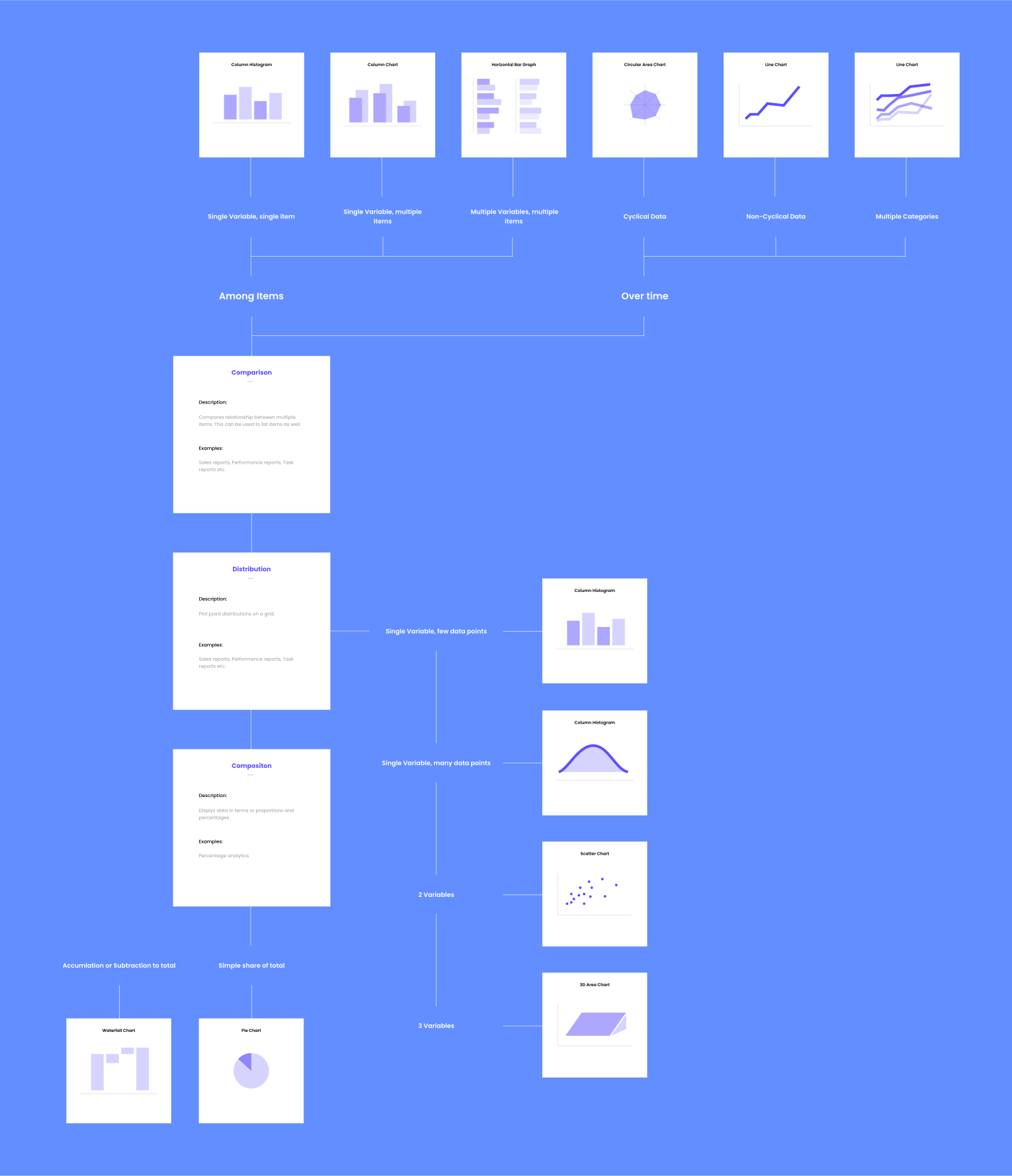
The initial proposal for a set of rules that indicates what charts and graphs to use under what conditions.
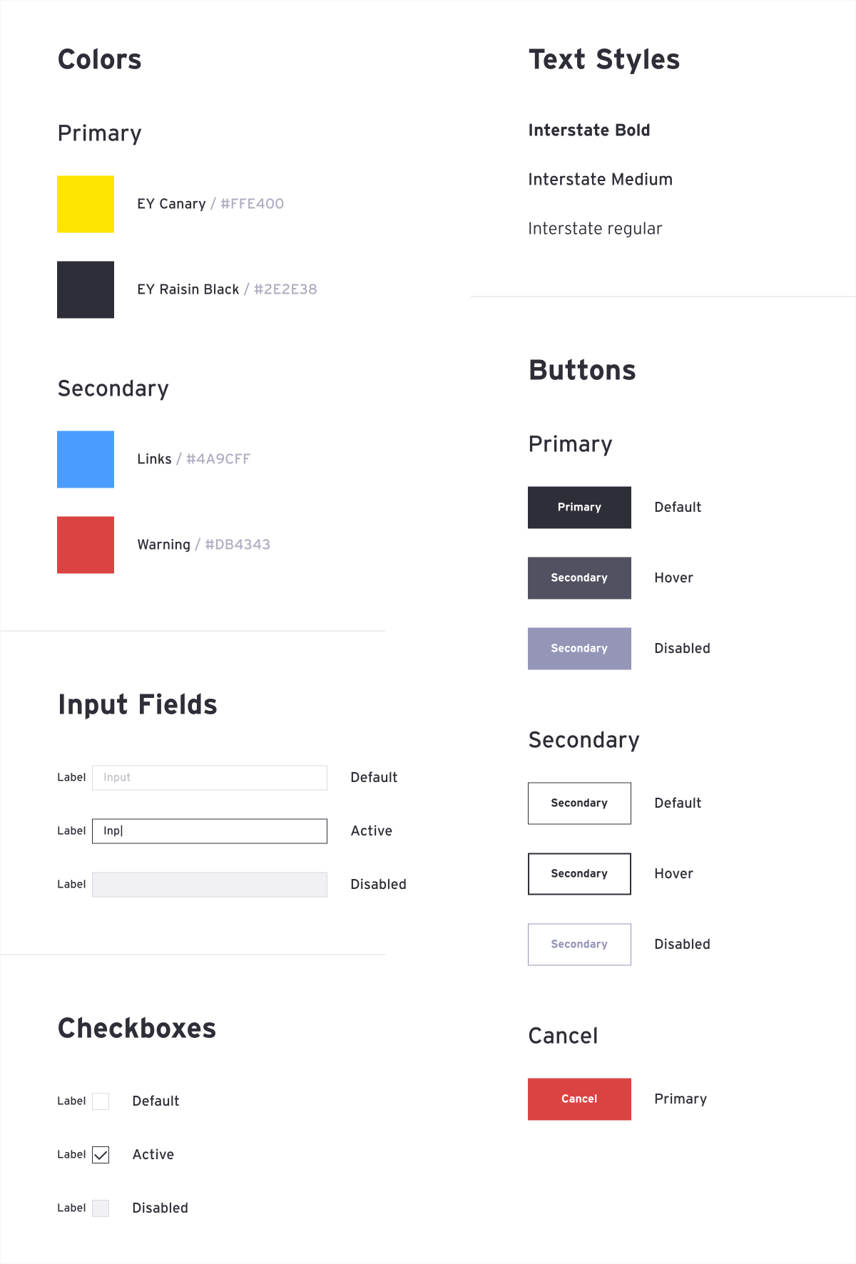
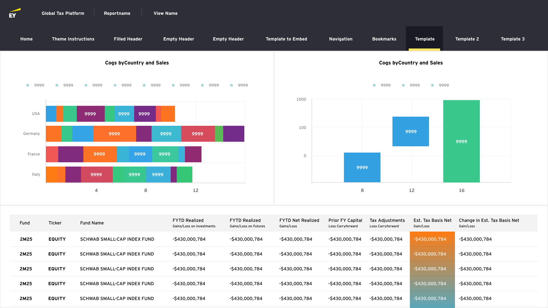
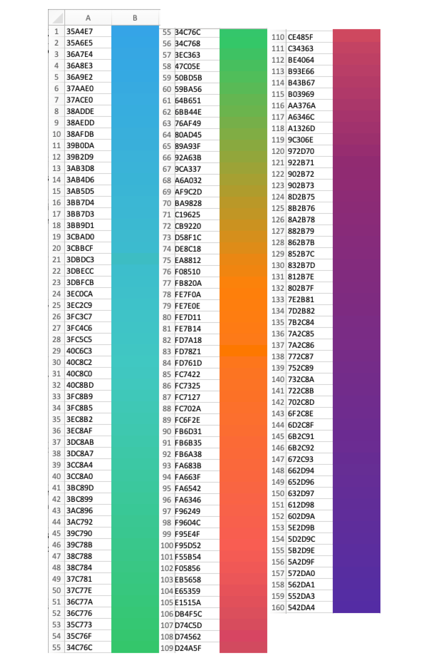
By leveraging a diverse color spectrum, we can effectively differentiate and represent large datasets with unique variations.
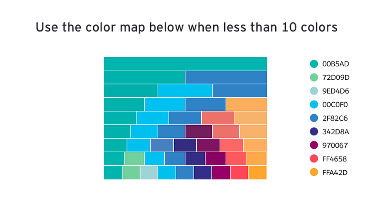
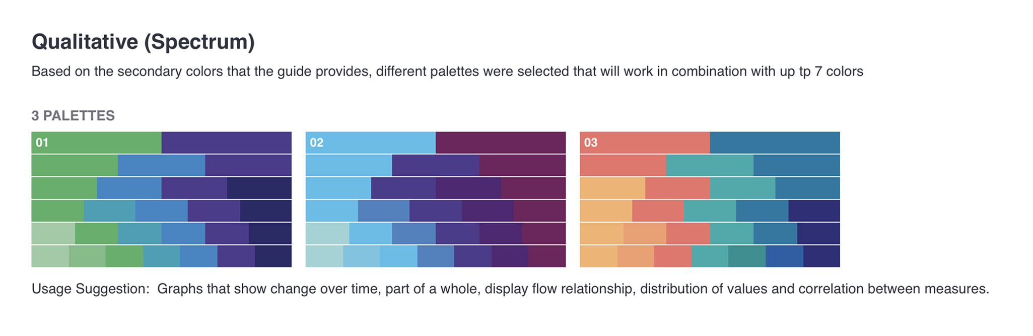
By leveraging the new color system, we can use it to represent various amount of data using the same color spectrum. This gives us more freedom to represent data of different categories in a more organized format.
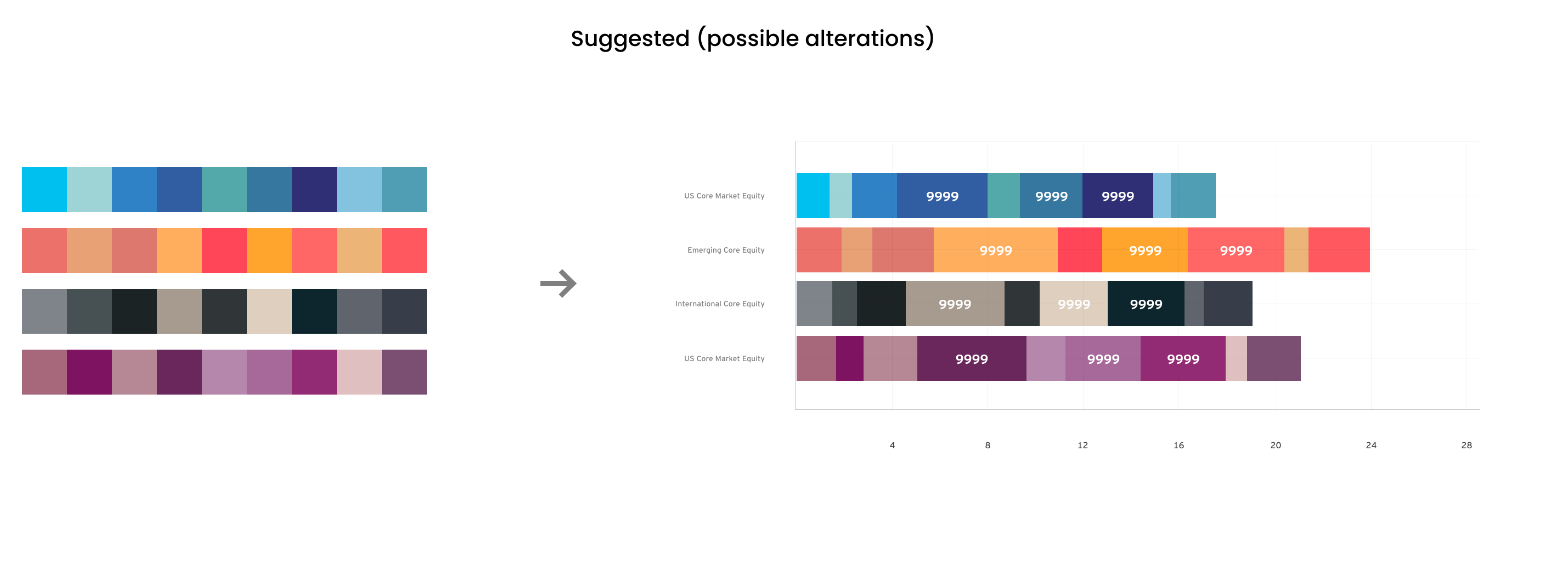
Before
After
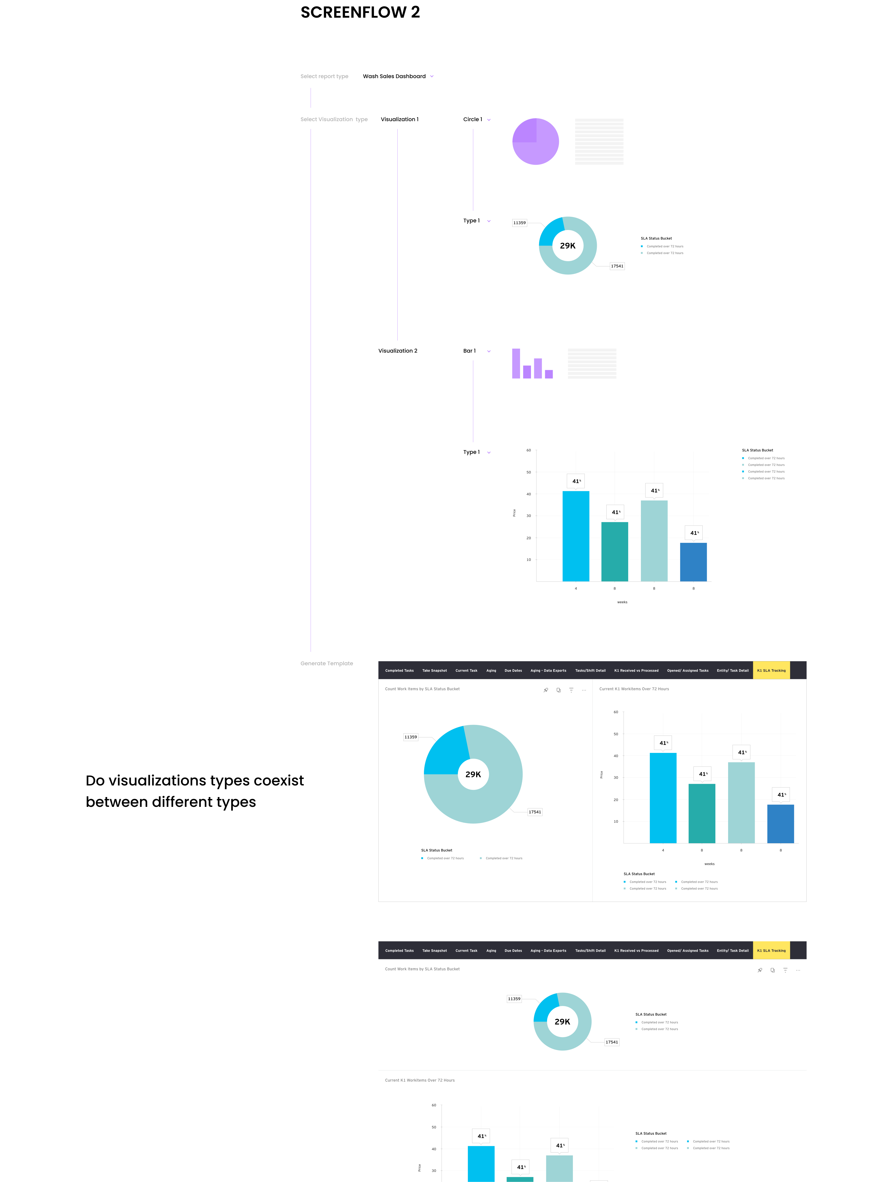
Building out a platform for developers to automate the report making process, while seamlessly incorporating the design system into the platform.
Flow
Usability testing was conducted to determine where improvements could be made and identify new ideas to satisfy user expectations, needs, and desires.
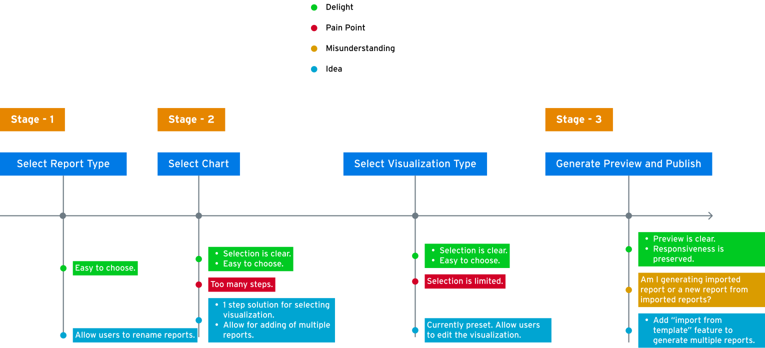
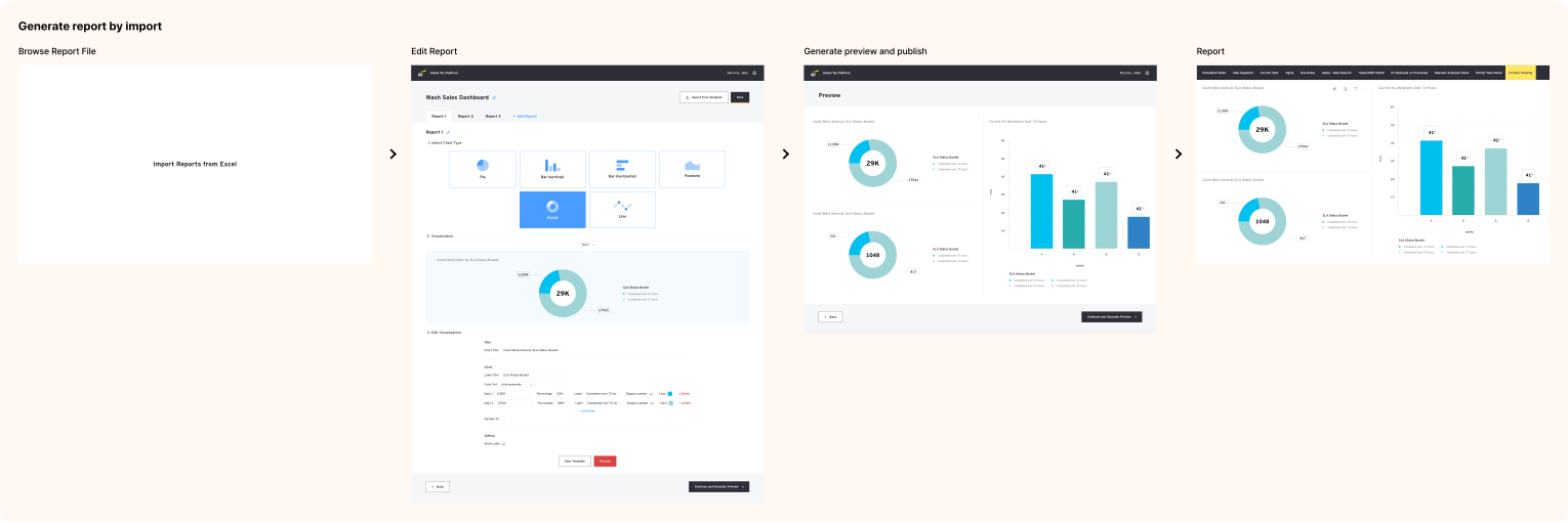
Allow users to further edit existing reports within platform by allowing them to create a new report through import via Excel sheet
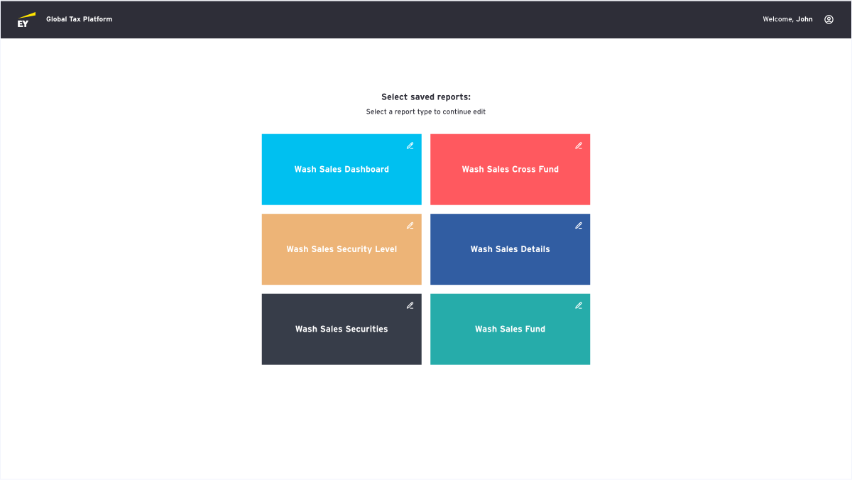
Allow users to create multiple reports within platform for easy edit and customization.
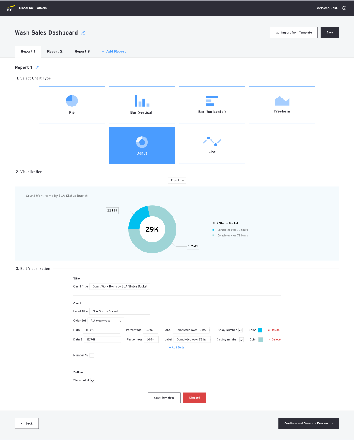
Allow users to edit visualizations in reports.
Wireframe - Generating a report
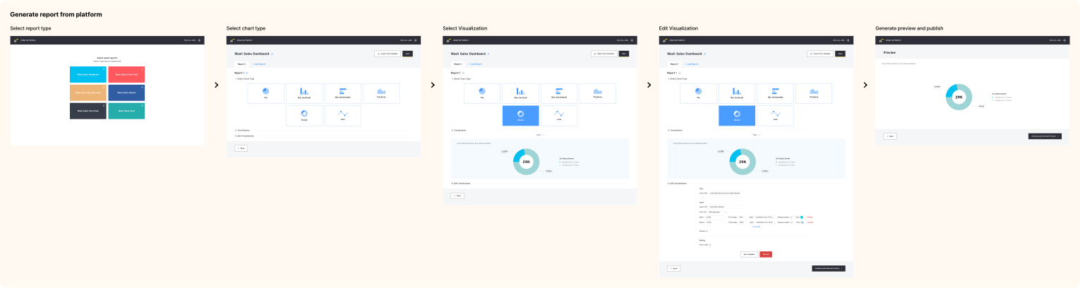
Wireframe - Generating report through import
Screens

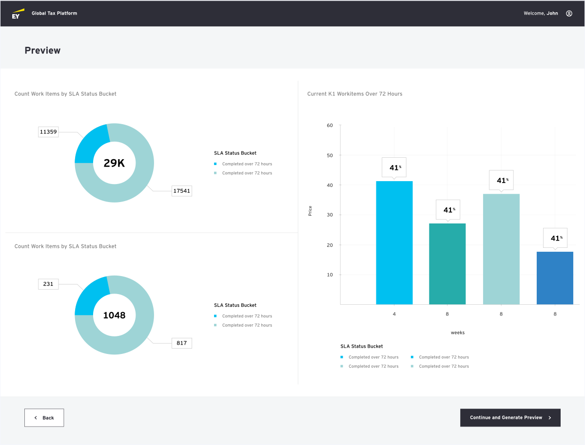
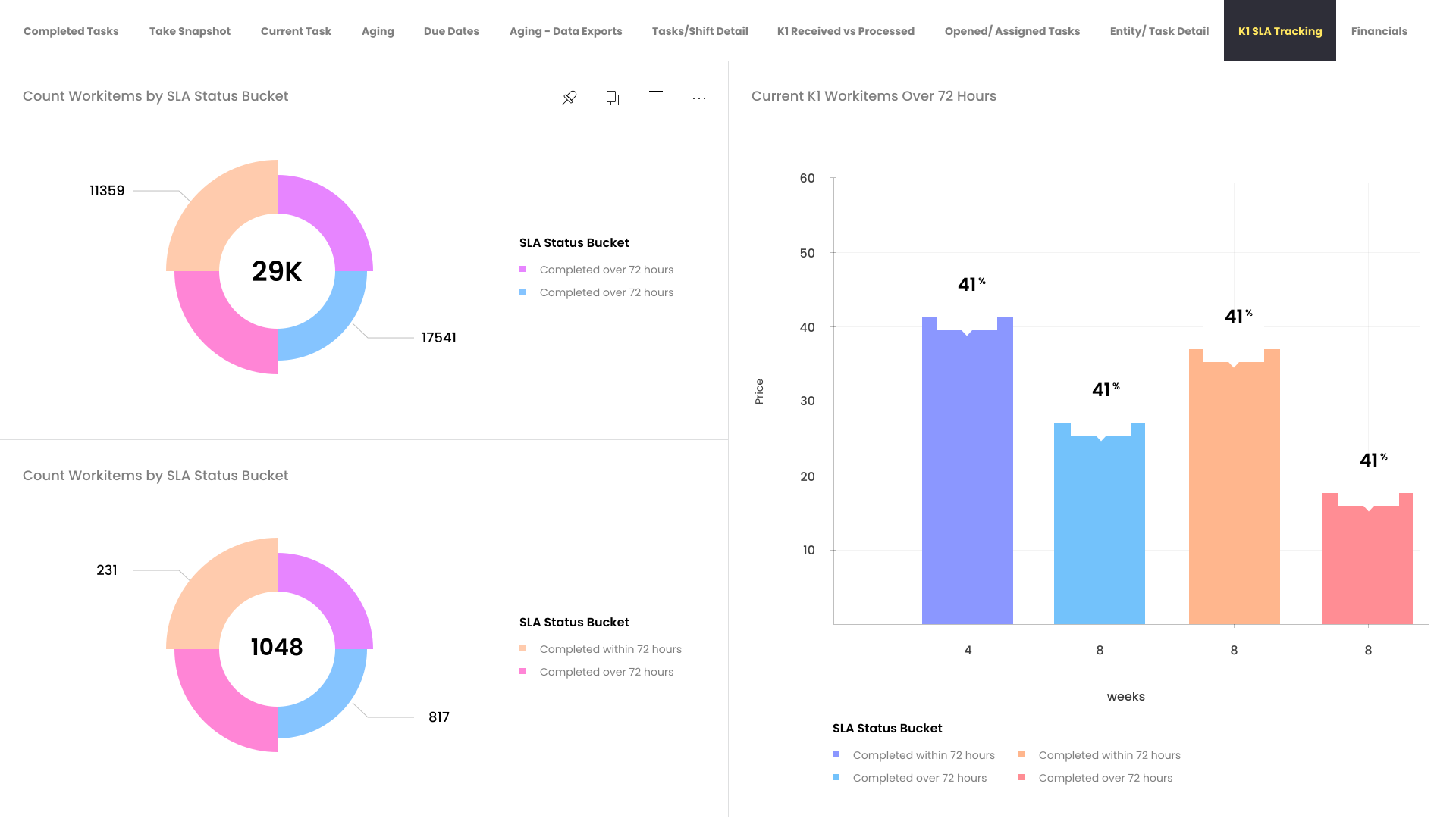
Generated sample report
I did a satisfaction survey to get a take from both developers and analysts about their overall satisfaction with the new updated platform. I’ve set up a specific set of questions to ask both parties. Below are some of the key questions.
Question: For developers
How would you rate your overall satisfaction utilizing the updated platform and the design system to create reports?
User feedback
The new platform overall makes the process a lot simpler. It still needs couple of more selections for visualizations but overall it’s a way faster process to generate a report.
-Tom, Developer
Question: For analysts
How would you rate your overall satisfaction with the updated formatting of reports?
Do you find the new system improves the readability and clarity of the reports?
User feedback
New version of reports are way more visually stunning than the previous one. I would still need to get used to it to an extent but overall the new reports are way more visually appealing and easy to understand.
-John, Analyst
The new design system and the platform had an overall positive satisfaction rate amongst the users.
2023 | RUWORKS, All rights reserved